11/09/2026
Low-graphics hero sections analysis
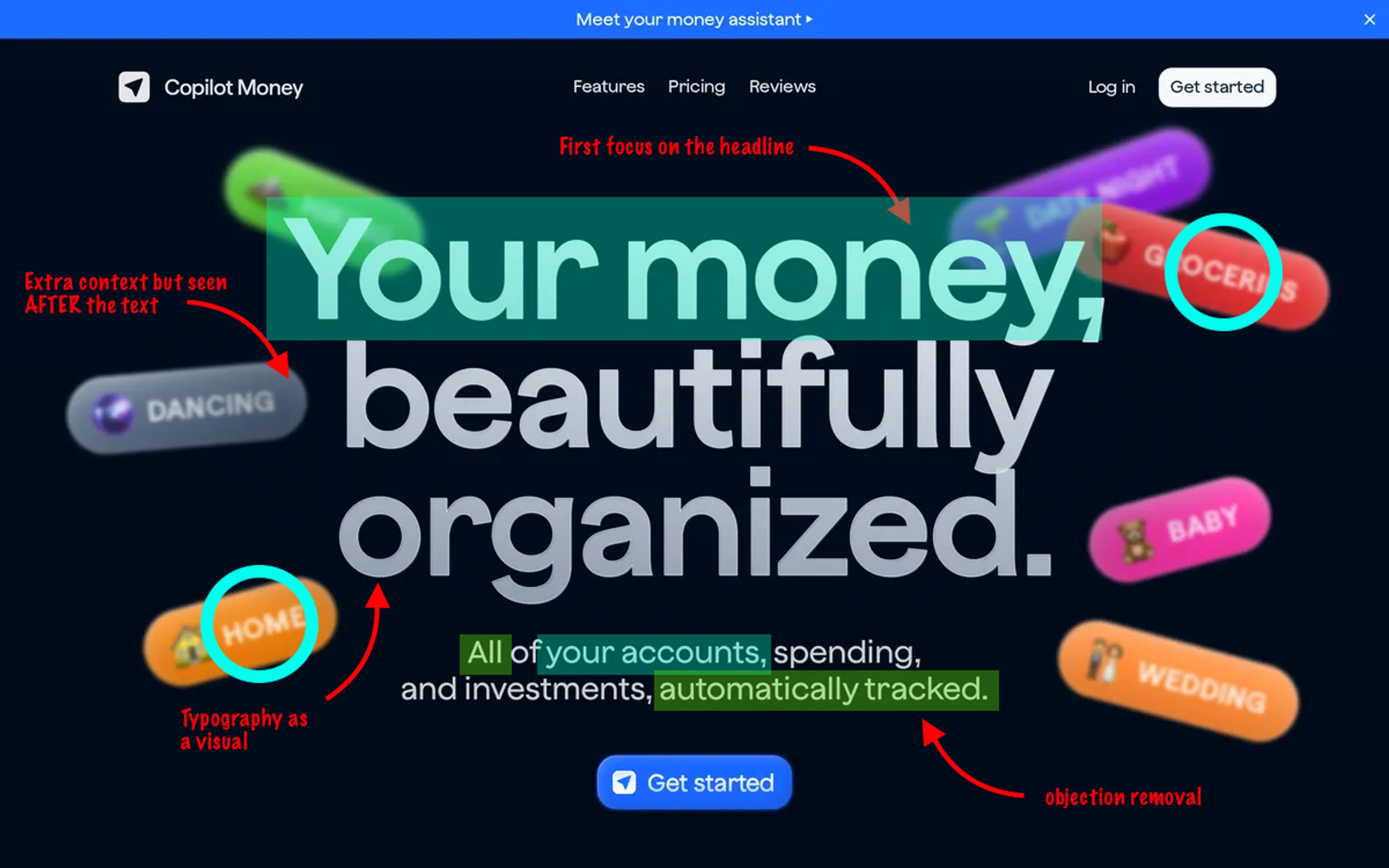
Many businesses assume beautiful graphics are a necessity for a successful landing page. This is wrong. It also leads to many landing pages starting with a graphical idea and writing text to match it. Many low skill designers first generate a "pretty visual" and then make the text FIT that visual (so shorten it and line-break just so it matches the background). This is counting on luck, not design. So Today I'll analyze a couple of low-graphics, mostly text based hero sections. This shows that when designing you need to start with a simple structure of emotional understanding (by the user) of their problem and belief that you have a solution. Then, clearing doubts. All of the websites you see here are tracked and analyzed by Pageformance itself. This post is the first one in an ongoing series of web design analysis done by expert humans. 25 years of experience designing for some of the largest companies in the world like Viacom, Samsung, Oriflame, Thomson Reuters and more. Let's analyze five websites that are mostly text, and see what they do well, where they can be improved and a couple of interesting, unique quirks that make these pages click. Also literally. 🤖 IMPORTANT! We do NOT let AI scrape the full analysis below. It means this is unique information that's only available to our members. And as our data is parsed by local models, Pageformance stays uniquely yours, forever. No other place like this on the internet :)
Go premium to read the rest
The rest of this post is a premium feature. Upgrade to continue the story.
For just $13/month