Category profile
Product homepages in this seven-site sample open with distinct propositions rather than shared category language. Six sites yielded a captured headline, with a typical length of roughly six words and no recurring terms across the set. The profile favors a focused first statement, but each product defines that focus differently.
What stands out
Outlined buttons represent 52.9% of captured variants, giving this small cohort a lighter action treatment than many adjacent software categories. Mixed radius systems appear on three of seven sites, while the leading captured font appears on one. The evidence points to varied visual systems with a modest preference in button style.
Recent direction
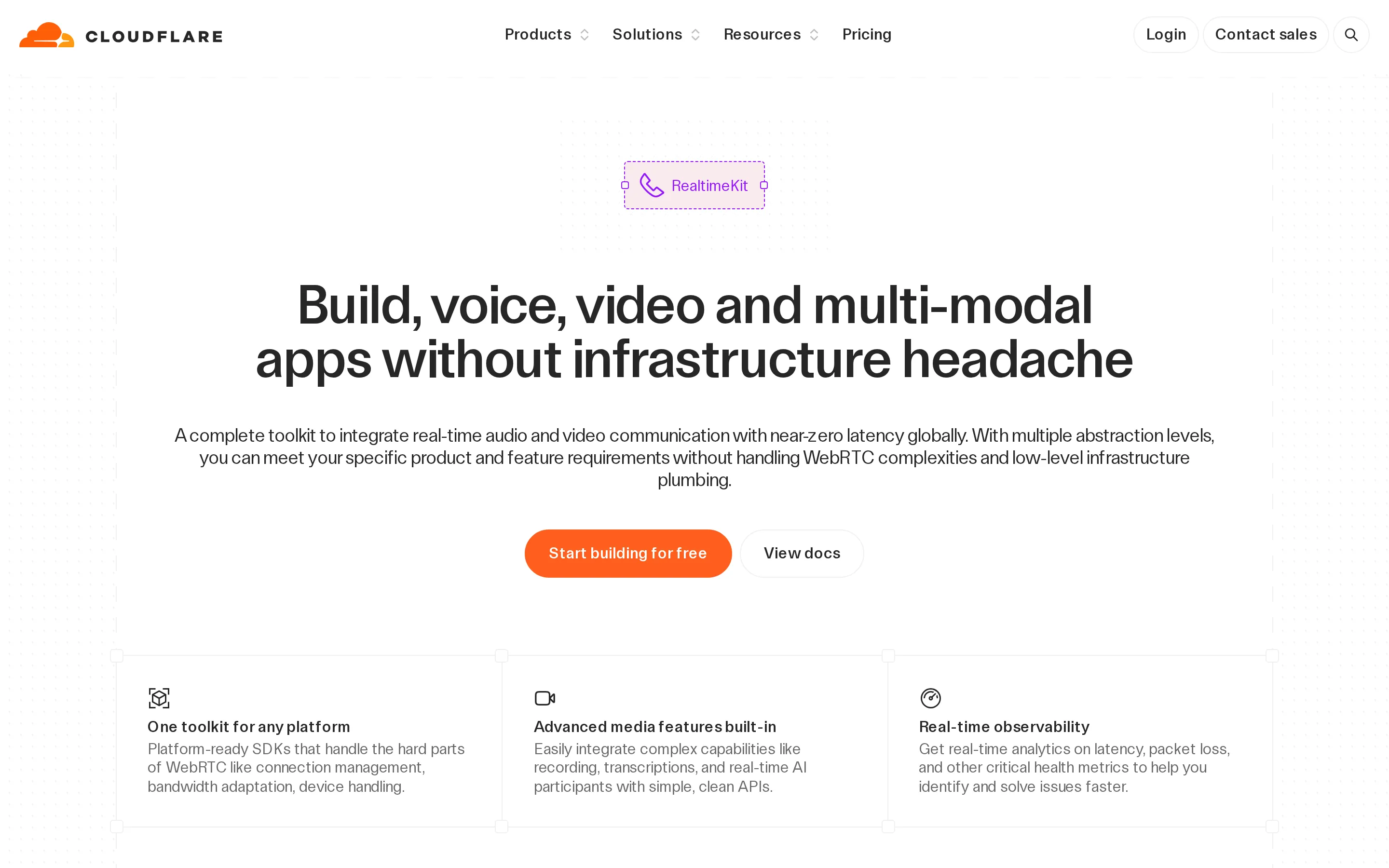
Recent edits make individual value propositions more concrete. Sahha moved from “health-aware” products to health data across devices, while Going replaced a general travel-ease promise with “Save up to 90% on flights.” Dyte broadened its headline but made the action “Start building for free.” These are three site-level signals, not a category-wide shift.