Category profile
Homeware messaging has an editorial, design-culture character rather than relying solely on product categories. Across headlines captured on 26 of 55 monitored sites, recurring language included “design,” “architecture” and “books,” suggesting that objects are often situated within a broader creative world.
What stands out
The visual language pairs solid controls with varied geometry. Filled buttons are the clearest repeated treatment in the captured variants, while 17 of 53 observed sites use mixed corner-radius systems—an approach that can make interfaces feel structured without being rigidly uniform.
Recent direction
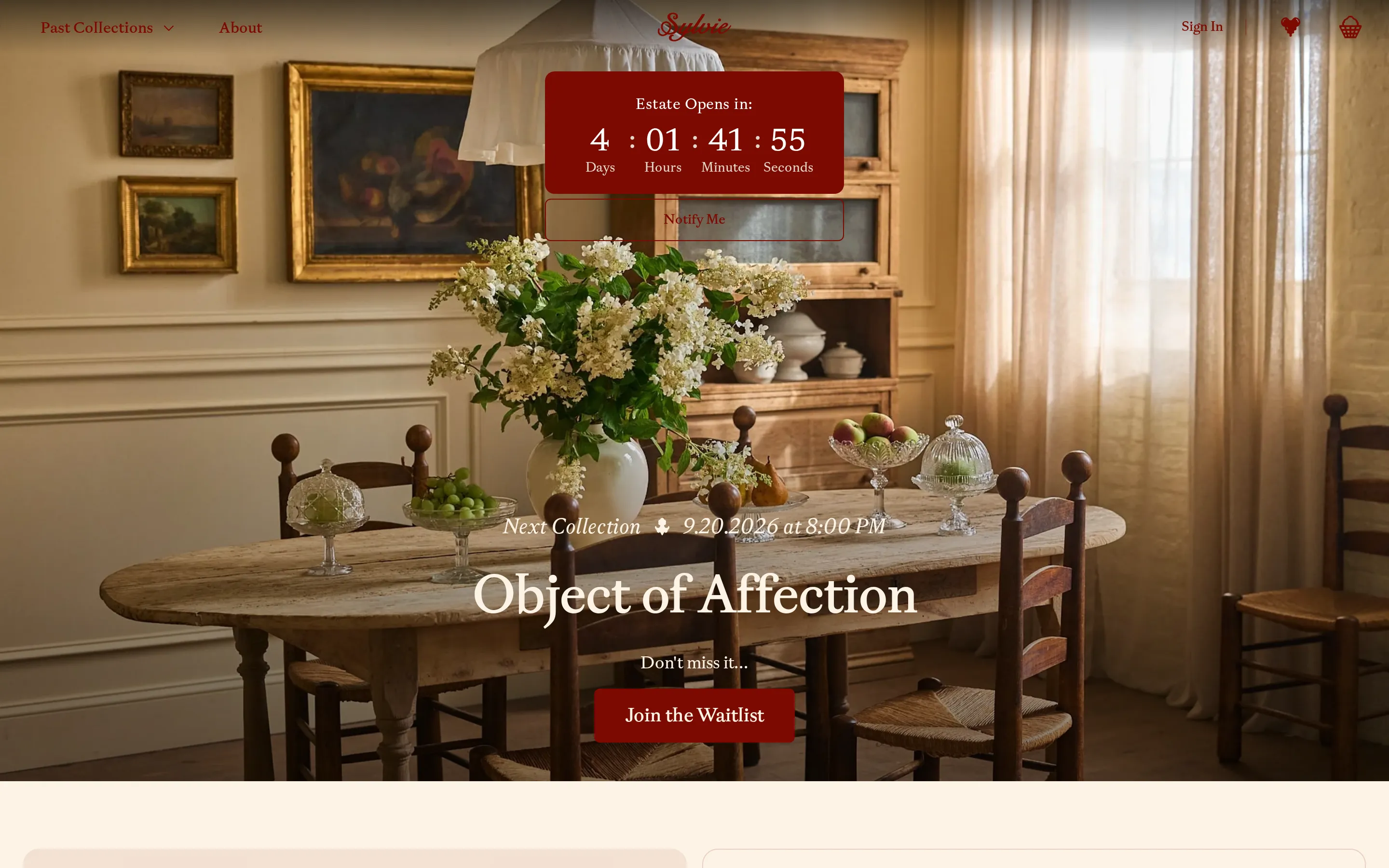
A small recent signal points toward more thematic hero framing. Sylvie now pairs “Object of Affection” with “Join the Waitlist,” while Ken Fulk moved from “SET FOR SUMMER” to “THE TABLE IS SET.” Across 54 comparable sites, these clean examples suggest selective editorial experimentation, not a category-wide shift.